50 Movie Poster Remakes (S-Z)
Written by Alexander Charchar
Here we are, the last stretch, the last eleven, the last show-downs. In this final part of the series on movie poster remakes, we get a look at Harrison Ford being creepy, Al Pacino acting the bad-ass, Chrispin Glover looking freakish and as always, Audrey Hepburn looking glamorous. What else could you ask for?
This is a good batch for balance. The split between which works better, the original or the remake, is almost divided straight down the middle. As what seems to be the norm, horror movies were remade over and over and so we have a few good comparisons, with the newer ones winning through simplicity and light splashes of colour. We also have a great example of a remake that is so laughable compared to the original you could weep—I'll let you figure out which one that is, but I'll warn you, it's damn easy.
The Other Parts
Part I (A-G)
Part II (H-L)
Part III (M-R)
Part IV (S-Z)
Sabrina (1954 & 1995)

The epitome of grace and elegance within the film world, Audrey Hepburn, stands playfully and is clearly the attraction to this movie. Yes, there is too much type, bizarre floating heads and someone either being punched or stretching out their back while a friend rubs their shoulder, but it all works so well.. even though it’s hard to tell what the movie is called. Then we have Harrison Ford looking as creepy as possible with a ‘... dance for me and call me daddy’ expression on his face. You pick which is better.
Scarface (1932 & 1983)
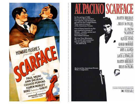
"Why you! I'll show you boy-o, put your dukes up, it's time to rumble! Time for a farce!" vs "Say hello to my little friend!" You can decide this one, too.
Anyway, now that obligatory Scarface line is out of the way, let's get to the meat. The 1983 version is so iconic I don't even know what to say. Tony lies between the light and dark, between being a peasant and a drug-lord, between life and death. A look of distaste for what he sees before him and gun in hand, the black/white/rad imagery is so fantastic that you look past the reams of type.
Shaft (1971 & 2000)

Why is Samuel L. Jackson silver? Minus the two cringe worthy tag lines (Still the man? Really? Most of the audience you aimed for wouldn't have been alive the first time Shaft was the man. And Any Questions? Come on, how bad-ass-pompous can you get?), the 2000 version is visually better to look at. Jackson comes off strong and fearless while the out-of-focus shot (from the waist down it isn't very crisp), the shots of the city in the background are great, with the red smog working fantastically to give a little colour.
My Fair Lady / She's All That (1964 & 1999)

Haha. I.. haha.
Солярис / Solaris (1972 & 2002)

What defines these two posters differently as good and bad is that which they have in common—a strong focus on strong artwork. The original has an interesting illustration that feels like HAL is watching. Probably just what you want considering the movie is set in space. The colours and expression on the face help give a feeling of unease and uncertainty, while the type feels very 70s-future, so to speak, which helps it work. I can't say that it doesn't draw me in and doesn't pluck the chords of curiosity. The remake works because it skips past the sci-fi. It gets into the veins of the story and shows that it is a love story, not a film set in space, which doesn't matter, what matters is the connection between the two characters.
The design of the remake is effective. While it might have been nice to have seen this without the reversed out text, the black bars almost emulate the feeling of space – pitch black with specs of white, perhaps a subtle reminder that this love story is wrapped in bleakness of the infinite? The moment we're seeing doesn't feel contrived, is intimate and a strong photo which, if anything, reminds us that when you have a strong photo, let it do all the work.
Plein Soleil / The Talented Mr. Rippley (1960 & 1999)

This comparison can almost go without comment. Neither have super strong points, but do nothing to offend. That being said, the colours of the remake are quite gentle and help give the feeling of the beauty of where the film is set, and the partley perplexed yet menacing expression of Matt Damon helps establish his relationship with the characters of Jude Law and Gwynyth Paltro. Again, while most covers are over saturated with bright colours, this one is noticeable because of it's limited range of hues.
Taxi (1998 & 2004)

HAHA! Get it?! He's armed, but she's dangerous! Because she's got a crazy taxi and goes REALLY REALLY fast. HAHA!
The poster is as about as good as the Shakespearean tagline. I probably shouldn't be so harsh. You shouldn't assume that a movie is going to be as bad as the poster (... or more accurately, the tagline). In this case it is, but you shouldn't always feel that way. I do feel sorry for the graphic designer who had to put this together. The strong focus on the imagery and restraint of the heading shows they know what they're doing. The tagline shows notes from the client.
The original is just great. You get a rush from the car flying through the air at break-neck speeds and, as with it's younger brother, the title is part of the artwork rather than slapped over the top of it.
The Texas Chainsaw Massacre (1974 & 2003)

Oooh yeah, by now you can't tell me that modern horror movie posters aren't leaps and bounds ahead of the originals. The text and imagery work well together, as we are only given the briefest of looks at Leatherface through an image that echoes the grittiness of the film, both in style and location. The effect given to the text goes in hand as we are given typography that is only barely gritty, but is at the same time lovingly typeset. As for the original's typography? Another movie title in quotation marks.
The Time Machine (1960 & 2002)

The remake is another one of those ‘well I guess it’s better’ posters. The colours used are nice and aren’t over saturated. The glow behind the text works well and in tune with the shades of light from behind the main characters, but the menacing eyes in the sky are just a smidge overboard. Not to mention the copywriter should have just gone for it and boldly submitted ‘When would you go?’ I must admit that the look of the new version is a nice change as it has that feeling of an illustration, rather than a photograph. A special mention – check out the bizarre creature so nonchalantly looking at you in the original.
When A Stranger Calls (1979 & 2006)

Clearly the remake is the better poster here. Typographically simple, all that black helps set the mood of what should be a terrifying movie. Perhaps it isn’t so bad when blown up, but the red gradient in the text feels uncalled for and the quality of the image in the phone is a little too crisp. Not because I think phones wouldn’t give that quality an image (obviously they can) but because it’s out of place. It should be desaturated and the screen should be scratched up and gritty like the rest of the phone. Not to mention the photo is upside down. The dirty arm in shadows is shockingly beautiful.
Willard (1971 & 2003)

And to round off the list we have Willard. The original is interesting as it’s so beautifully simple and gets you to think about what the film might be. Is Wilalrd the rat? Is it a rat? Why does the rat look so freaked out? But the new version is the winner for me as the use of lighting in the photo is stunning. Shrouded in darkness, Chrispin Glover looks longingly at his fury little friend. This one gets into your head because you can’t help but ask your self ‘... whats with the dude and the rat?'
Find out what it means to me
Respect is something that everyone appreciates. Everyone wants to feel respected by those they interact with and it's no different when they interact with a designer. What is different in this case is that they interact through a poster. A lot of these posters, the remakes at least, lets the audience figure a thing or two out. I'm willing to be the posters you were most drawn to were the ones that asked a question, but didn't answer it.
I think well over half these posters let the audience try to solve a small riddle. Who is this kissing couple? Is it envy or spite in his eyes? What's with the rat?
Now think about those posters that didn't raise any questions. They're a little laughable, right? Exactly.
So remember to respect the audience. They're smart, after all, you are, aren't you? Why would they be any different? Create puzzles, stories and raise questions. It gives extra depth and shows that you really thought about the work you were doing and wanted to give the audience a little treat.
Oh, and as a sign of respect, I'll apologise for there being no Z. S-W just doesn't have the same ring to it.
The Other Parts
Part I (A-G)
Part II (H-L)
Part III (M-R)
Part IV (S-Z)
REFERENCES & LINKS
Speakup: Dark and Fleshy: The Color of Top Grossing Movies
A great article on the colour scheme of the higest grossing films, lovingly put together by Armin Vit at Speak Up.
Characters on the Silver Screen - July 2008
A great article at the Fontshop blog about the fonts used in a few movie posters from the last few months.
Wikipedia - List of film remakes
This is where I found all the information needed for the film remakes.
COMMENTS
LaurenMarie - Creative Curio
2008-09-29 20:43:52 + LaurenMarie - Creative Curio's website
haha, I haha'ed at your haha... ha. :P I didn't realize that She's All That was a remake of My Fair Lady (would it be awful to admit I've not see that one?). Anyway, orange and purple?? EW! It looks like a sports team poster!
Before I even read your comments on Time Machine I thought the same thing; "well... neither is all that attractive."
The first Wilard one makes it look like the rat is Wilard, and he's not very creepy. For the new one, what is with the lines behind "Wilard"? Does it have anything to do with the movie? It's distracting at any rate. I think there was another Wilard poster that had Glover as a silhouette coming out of a door with the rat army around and ahead of him. That is more creepy than a weirdo petting a rat, don't you think?
Alex Charchar
2008-09-30 14:25:51 + Alex Charchar's website
I hadn't realised it either, until I was going through the list on Wikipedia and saw She's All That next to My Fair lady.. was.. a little odd, to say the least.
Because I was aware of the new version, the original poster for Willard didn't seem that out there, but you're right, it could be conceived that Willard is the rat, good catch.
Also, the lines behind the type would be in an effort to create a little more interest? But I agree, it is distracting. as is the alignment of it. Center alignment isn't always a great idea, but it would have worked here.. and it would have been nice to have seen the title a little smaller so it had more room to breathe, what do you think?
LaurenMarie - Creative Curio
2008-10-01 07:40:52 + LaurenMarie - Creative Curio's website
Yeah, the alignment is a big oops, especially in light of ALL the other text being centered (actually it looks like the tagline is centered on the title... that is just so weird!). The size of it doesn't bother me too much, but I don't think it would be a bad thing if it were smaller.
Clare
2008-10-05 15:39:11 + Clare's website
I enjoyed this artcle, very interesting. I wonder if you repeated this in 30 years or so what you'd think of the current day posters compared to ones that are around then.
Alex
2008-10-06 11:38:37 + Alex's website
I'm glad you enjoyed it Clare.
I've been thinking a lot lately, which I'm sure is due to this series of articles, how a lot of the work I perceive as good now will hold up in another 10, 20 or 30 years. Makes you question a lot of the decisions you make when designing, I can tell you that.
mitch
2008-10-11 14:01:47
i love:
the omen (new)
i agree its kinda funny isnt it it looks sorta like a student work, but in horror, the more 'wrong' it looks, the higher the creepiness factor. its quite an original design breaking the rules an it works really well! creepy!
nikita (old)
the picture and layout are really nice. it does give me that 'whats this about?' look in my face. i dont know if its a bad thing but it didnt reveal much about the movie to me, both the title and the picture. heres where my mind makes the decision to be curious about the movie or dismiss it as 'i dont understand this'. but it does look cool.
the ring (old)
the picture alone is so original and scary. the old japnese version was a big hit over here and that picture did it. it was the first japanese horror that catapulted the trend. i would excuse the taglines and bad design because its a 'japanese horror poster' and gives the feeling, 'the designer was too caught up being scared and communicating the urgency of how badly we need to watch it' and had no time in making the design!
planet of the apes (new)
like all the really good new posters and this particular "style" with analogous color scheme (usually either blue or orange) (do u have a name for it?)
i find it cool i like the way there are alot of 'round' elements: the moon, the shape in the sky, and i like the way the faces sort of go in a spiral and the war picture.
i noticed the mummy IS always yawning hehe. do u think its a bad thing?
Alex Charcahr
2008-10-12 16:03:24 + Alex Charcahr's website
Wow mitch, great comment!
I knew the Ring was a big thing in Japanese cinema, I just didn't know it had really started a phase over there.. interesting point.. I actually hadn't thought that maybe the roughness in the design is a deliberate attempt to make the viewer anxious, it's a good thought..
and I like your observation of the planet of the apes poster -- all the round elements.. there are few-to-none sharp lines causing everything to fade into the night and one-another.. as for what you'd call that use of colour? It's not quite mono/duotone, but you wouldn't be too far off in saying that.. just minimalistic in its use of colour, perhaps?
Oh, and I saw the second Mummy, so maybe the constant yawning isn't a bad thing?
Anrkist
2008-10-25 21:06:28
This was a fun read. I've been somewhat fascinated by posters since my encounter with Polish movie posters. Check Google if you haven't seen them. In fact it might be nice to see a comparison article on those alone.
At any rate, I found myself disagreeing with you on many of the comments... I really felt the older posters, specifically the "hand drawn" ones were far superior. Vibrant colors that seem to really jump out and catch the eye.
While a lot of the newer ones are beautiful, I feel like they blend into the movie theater & get lost in the mix. I can't say I even look at them when I go to the movies... unless I'm waiting. Some seem so cliche as well.
There is also a fond respect for the hard work that went into the older ones... no doubt, many of the newer ones were done within a couple of hours with the use of Photoshop.
Alex Charchar
2008-10-26 03:21:37 + Alex Charchar's website
Hey Ankrist, thanks for stopping by. I'm glad it was a fun read for you :)
The amount of effort that went into the older posters was probably far greater than a lot of the more modern ones, absolutely. And some of the older ones are far, far superior than the newer ones (Sabrina on this page for example)..
And believe it or not, I'm actually glad you disagree with me on the comments, it means we can have a bit of fun back and forth :)
So, which comment/comparison bothered you the most? hehe
Anrkist
2008-10-26 04:11:19
You got it.
Godzilla - You have to look at it through their perspective at the time and the country. I've seen my fair share of movies from Japan and they make Britney Spears looks like an old maid in terms up pop culture. Very in your face, very busy. That said, the new poster is very well done.
Gone in 60 Seconds - Nick cage is a focal point, never a good thing in my book. The mashup of the original version almost looks like something you might see today in certain types of art. Think a floral only with cars.
The Hills Have Eyes - Michael Berryman. Anytime this guy is on anything, it ultimately puts it on my "I'm scared" list. He even scared me in Weird Science.
Insomnia - You got me there, I thought Darryl Hammond was in the film based on the poster.
The Lake House - Well, I'm biased, I'd have left this one off. They both suck. My dislike of a cliche love film. I'll assume they were, based on the poster.
The Last Kiss - I'll give it to you that the latter is better but the leading on the words is atrocious. Unreadable. Looks like someone threw up a buncha words and got away with it.
The Longest Yard - Well, you know the ladies liked the old one... I'm just sayin. Sometimes you have to play the needed demographic.
Manchurian Candidate - Keep in mind, back before the internet, one of the few ways to let people know who was in the movie was to blow their names up on the poster. In today's world, it isn't as much of a necessity.
Oceans 11 - Both amazing.
The Parent Trap - Really?? the new one just seems... bland, I'm talking Folgers' bland. The old one seems fun. In fact the bored male parent is a precursor to the male shmucks in television comedies of today. It really was ahead of its time.
Shaft - As much as I like Sam Jack, Roundtree was the man of his time. Putting him on the poster blowing some unknown thing away with a pretty slick tag line puts this one ahead.
Solaris - You mention Hal, but I wonder if the Red Curtain had even seen it? Probably, but there's some interesting history there. The new poster is just putting me to sleep, as much as I love this movie. It's even true to the movie in a lot of respects but if you've seen one poster with people kissing, you've seen ‘em all.
The Talented Mr. Rippley - Neither are great, but what I love is the vibrancy of the older poster... really gets my eye. The new one is very duotone. And as much as I like Damon, there’s a bit too much of him.
Alex Charchar
2008-11-09 11:57:42 + Alex Charchar's website
Wow Ankrist, what a reply! Some great comments there!
I liked your comments about the original gone in 60 seconds as floral, but with cars.. one thing I noticed while going through all these was that a good number of the posters are an overlaid illustration look.. I guess they were done at a time when minimalism wasn't something they wanted to go for?
Interesting point about Solaris and if the Red Curtain had even seen it at the time. The new poster is awfully soft and quiet, but the way their characters are posed in the shot is one of the few good examples of a couple in love on a movie poster that's around I think.. As opposed to The Lake House.. which, you're right, cliche love film..
I think the difference between The Parent Trap posters is that one feels designed while the other is illustrated, making for a rather miserable comparison. It now being a while after having written those comments, I think I might now prefer the original in design!
3.22 Copyright (C) 2007 Alain Georgette / Copyright (C) 2006 Frantisek Hliva. All rights reserved."
META
50 Movie Poster Remakes (S-Z) written by Alexander Charchar
29 September 2008
LATEST


