Let’s get ready to ruuummmbllleee!! In the red trunks we have the movie posters of the originals, coming equipped with some highs and lows in their career, and at certain angles, unflatteringly showing their age. In the blue trunks we have the younger, the newer, the remakes! They can sometimes be all flash-bang with their photoshopped, oversized faces, but are fully capable of delivering a masterful punch. Ahem… now that’s out of the way, let’s have a look at 50 movie posters and how they’ve been designed for movies that have been remade … round one!
Remaking a movie, or anything really, is an odd thing to do. Essentially those involved are saying either “it was done wrong the first time, we can do it better” or “it worked before, so let’s repackage this and make some money”. So what about the designers behind the marketing material? They can either reinterpret the poster in the same way the director might reinterpret the movie, or they could go right off centre and doing something altogether different. In this four part series, I pit the originals against the remakes for 50 movies; totalling in 100 posters.
One thing to note: in all but one or two cases, these are the posters that Wikipedia provides as the theatrical versions. With pretty much any movie there are many, many posters, depending on the country they were released in, budget, the cast involved and a million other things. So for these posts, I’m only talking about the two posters shown.
The other parts
Part I (A-G) • Part II (H-L) • Part III (M-R) • Part IV (S-Z)
Alfie (1966 & 2004)
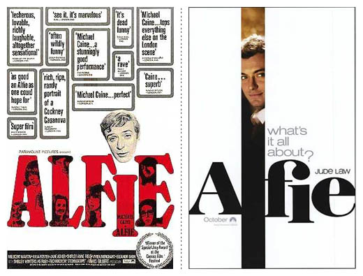
Let’s start with getting one thing straight – Michael Caine is awesome. This poster however, is not. The huge amount of quotes thrown all over the poster where ever they can fit just makes Mr. Caine’s floating head suffocate.. which would explain why this modern day Casanova looks so unhappy, which brings up the question of if this can really be considered the original theatrical poster?. The newer version of the poster shows some lovely constraints, hasn’t got the stars face half the size of the poster and uses a lovely ligature! A ligature people! You don’t see that everyday in movies posters. The strip that captures Jude Law is a little thick for the font used (but only barely) and the “what’s it all about?” with it’s sinking question mark reeks of the marketing department. Overall, 2004 Alfie is the clear winner, especially as the stray head of the 2004 version is a great nod to the original (be it coincidence or not).
The Amityville Horror (1979 & 2005)
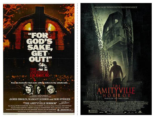
While putting this list together I realised that a lot of the posters for the horror movie remakes are far superior to the originals. That being said, I’m not sure this one falls into that category. I’m a big fan of massive, strong typography and the “For God’s sake, get out!” quote makes me smirk every time. That being said, I do love the logotype for the 2005 version, and it does direct the eye better, especially with the far more interesting imagery. But the 1979 version is so killer (hah, get it?) because of that quote.
Bad News Bears (1976 & 2005)
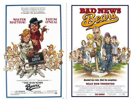
The thing that I can appreciate the most about the 2005 version of the Bad News Bears poster is the fact that the designers behind it decided to directly recreate the original with the new cast in tow. While the illustrations of the original are slightly better because of the strong shading, the layout is not. The 2005 version doesn’t hide the title of the movie, which is now filled with colour and a lovely and ever-so-slight gradient and, best of all, the star’s name doesn’t come first.
Carrie (1976 & 2002)

As I mentioned earlier, in the last few decades, horror movie posters have just gotten better and better. This over the top remake works for so many reasons. A. It’s scary as hell. B. It’s gross as hell. C. It’s so simple! The idea is fantastic, as is the layout. The blood-soaked teenager image used is one that is strongly associated with this film, and is so powerful that nothing more is needed. The colour combination is an all-time winner (it’s hard for black, white and red to not look good), but I can’t help but wonder if it would have looked better red on white? Could it have been done better? Yeah, sure, of course. But does it work far better than the word-art and (why are they there?) quote marks of the original? Absolutely.
… And The Chocolate Factor (1971 & 2005)
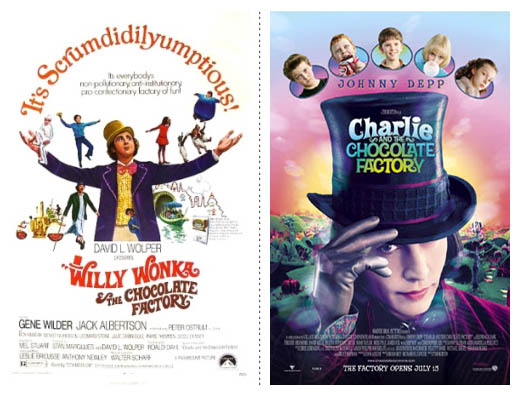
While the vibrant colours of the 2005 poster are beautiful, eye-catching and visually taste like candy, the glove on Depp’s hand creeps me out. The colours used aren’t overly vibrant or bright, something that you would expect for a film mostly aimed at children—they are soft, making for a less obnoxious poster. The wild ampersand employed by the killer title-type in the 1971 original is worth a mention, as is the floating gum-girl trying to be caught by an umpa-lumpa. But it is all over the place – it’s almost hard to tell where to look and what’s important (is the movies name “It’s Scrumdidilyumptious”?), where as the 2005 version has obvious visual hierarchy and is far more appealing.
Dawn Of The Dead (1978 & 2004)
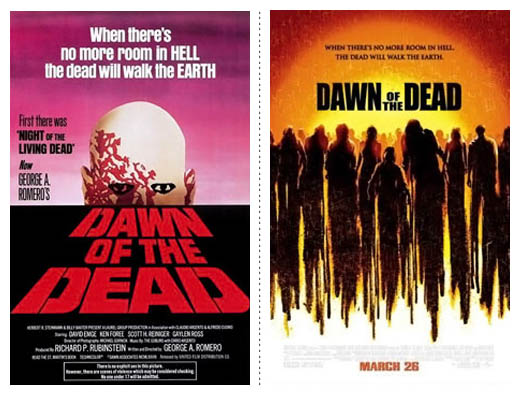
How is it that a poster from 2004 looks like it belongs in 1978 and the 1978 poster belongs in 2004? The giant face and too much text feels like it should be a poster from this decade, where as the simple, illustrated and elegant poster of 2004 seems older, or perhaps more accurately, timeless. Either way, the 2004 is clearly far better than it’s man-with-a-rash older brother.
Day Of The Dead (1985 & 2005)

2005 has it – scary as hell. Although the setting moon/rising sun is a damn nice way to reference Night and Dawn of the (Living) Dead, the splattering of blood, the minimalistic use of blood-red for the text, the textured background and over the top zombie is fantastic, as well as the beautifully bloody typography of the title. That is, except for the sunken A.
The Fog (1980 & 2005)

It’s 1980 and you’re walking down the street. Something catches your eye. It’s beautiful reds and oranges, with a menacing silhouette in the doorway. The coloured fog is so eye catching that you don’t even notice the “oh, we need to put it somewhere” tag line in the top right. Now flash forward 25 years. You’re walking down the street. You miss the poster of someone yawning and go on with your day. K-O.
Godzilla (1954 & 1998)
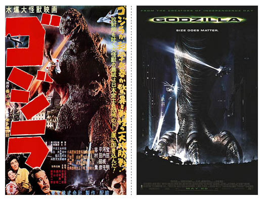
The 1998 poster succeeds in many ways. It’s a small tease to how giant Mr. Lizard Man is, isn’t cluttered with type, shows a good deal of restraint on behalf of the designer and has the (as a good friend once told me) best tag line for underwear ever; ‘Size Does Matter’, but I can’t pass over on the 1954 version. He’s shooting fire from his mouth!!
Gone In 60 Seconds (1974 & 2000)
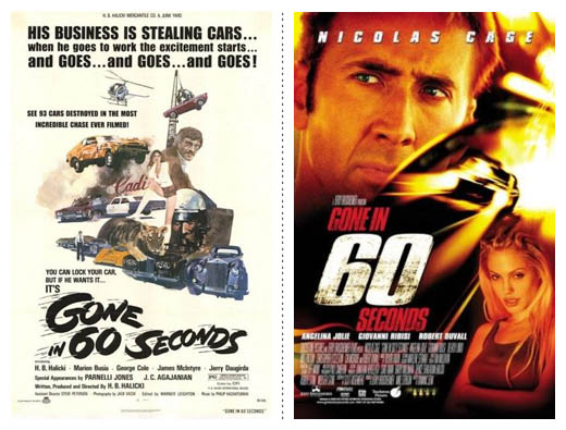
The 2000 version gets it. Clearly in the ‘if there aren’t pretty people on the poster, no one will see it’ camp, we get a concerned looking Nicolas Cage and a mouth-slightly-open (as always?) Angelina Jolie. But I do love the type and can’t help but think that if you removed the photos of the stars, you’d have one damn nice poster. The textured 60 and the glow of fast-moving cars is just what you need to get a little bit of adrenaline going.
The Grudge (2003 & 2004)
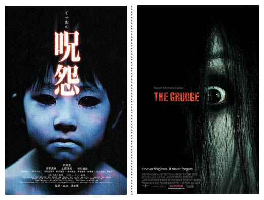
It’s almost hard to believe that only one year separated these two films. Both are fantastic posters, but the emotion felt through the wild-eyed 2004 version is about 10% over the top. The lack of expression due to the flat, blue faced-black eyed child on the left is far scarier, so 2003 wins when it comes to imagery. Sometimes it’s the not knowing that’ll get you. In this case, you don’t know if the kid will put his arms out for a hug, or rip your arm out of it’s socket. However, the 2004 wins for layout, even though title of the film might (I stress might) have been a smidge better with a little tinkering. When it’s bigger, it might look better, but I can’t help but feel a flat red, or only slight red/dark-red horizontal gradient might have worked a bit better? Also, the text is a little too close to the eye as it feels like it’s intruding on a space that should be protected for the damn nice image.
12 pairs of posters down, 24 posters seen.
We got off to a good start with some great posters, especially the Dawn of The Dead remake, and there is plenty more of great, and not so great, posters to come. Aside from being a bit of fun, comparing these works helps to show patterns taken and the kind of things you need to look out for and take into consideration when first starting a design.
For now, have a look at the posters and think about the audience to whom they are being aimed at. All these posters, and almost all 50, feel the same in their pairs. Be it through colours used, the compositions of the images, contrast and amount of type, they are all aiming at the exact same audience, at the same age, just with different years of birth. There are certain conventions that don’t particularly change, so take this with you; always look at what is already out there, not to see how something should look, but how it should feel visually.
Part I (A-G) • Part II (H-L) • Part III (M-R) • Part IV (S-Z)
REFERENCES & LINKS
Speakup: Dark and Fleshy: The Color of Top Grossing Movies
A great article on the colour scheme of the higest grossing films, lovingly put together by Armin Vit at Speak Up.
Characters on the Silver Screen – July 2008
A great article at the Fontshop blog about the fonts used in a few movie posters from the last few months.
Wikipedia – List of film remakes
This is where I found all the information needed for the film remakes.
Master Your Craft.
Weekly.
Become the designer you want to be.
Join a group of talented, creative, and hungry designers,
all gaining the insight that is helping them make
the best work of their lives.