“Understand the rules before you break them.” A mantra we become all too familiar with when studying. Something many of us found bothersome as it implied subjecting ourselves to a rigid framework—and what creative wants that? Then we learn the rules, realise that they actually do work and start to use them well. The rules make it easier to play the game. The Ten Commandments of Typography serves as a reminder of these safe, warm guides. The second half of Paul Felton’s fun little book reminds us why performing Type Heresy is so devilishly satisfying.
Paul Felton’s The Ten Commandments of Typography/Type Heresy weighs in at a quaint 80-pages and is one of those books that makes you smirk and return to. It’s also one of those books you get excited about introducing to your typography-loving friends because of its wit and easy-to-digest size.
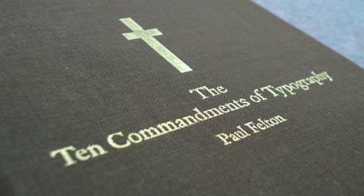
As the title suggests, this is a book of ten rules and why they should be obeyed and why they should be broken. For most, it’ll serve as a reminder of school days past, something Felton seems to have kept in mind. More than a guide book on typographic basics, Felton gives us something fun and enjoyable. It takes something which we love (typography) and something we’ve all grappled with (‘the rules’) and pushes them to extreme ends of the spectrum.
Ten Ten Commandments of Typography
The rules of typography serve as guides to ensure legibility for the audience. They help messages be heard and ‘prevent mistakes’. The first 37 pages is a good reminder of what they are and gives straight forward examples of each.
It would have been easy to make the book bigger by the nth degree, employing piles of examples to show the rules in use in the wild. An easy way to make the content superficially prettier when flicking through and a easy way to pad out the page count. Easy, but stupid. There is a commandment and a justification or expansion on the left page, example on the right. An elegant and restrained design becomes the ideal vessel for the enjoyable content to travel in.
An elegant and restrained design becomes
the ideal vessel for the enjoyable content to travel in
The writing is quirky and fun and is where the real power of this book comes from—rather than those piles of images left on the cutting room floor. The quirkiness of the content is strong enough that the text does all the heavy lifting and the design mostly fades into the background – the way it often should.
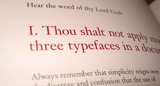
Written in a biblical style, the content goes so far past serious that it crashes into the absurd, serving as a reminder of the zealous who make working with typography less fun. Written seriously, without taking its self thus, the wittiness of the copy will suck you in.
The second commandment is a great example of the over-the-top writing found between the covers:
II. Thou shalt lay headlines
large and at the top of a page.
Raise the headline to a windy height, roar out your
summons, and beckon with considerable type size
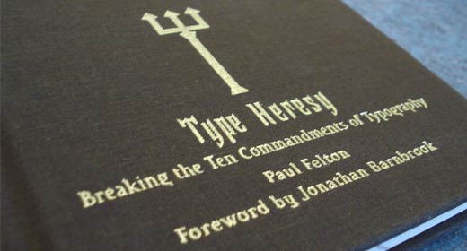
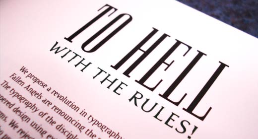
Type Heresy
Reading the second half of this book, I can’t help but think that Felton had a lot more fun with it than he did the first. Or it serves as evidence that breaking the rules injects a little more personality into a design.
Repeating the commandments, we are now given an argument against each, as well as an example and reasons behind the rebuttals. Most of which I read and thought ‘hell-yeah! why not?!’ It’s more fun breaking the rules—it’s good to be bad, no?—something you’ll notice in the second half of this book. The layouts are more interesting and differentiate themselves from one another and are more memorable.
Which raises an interesting issue – if design is to respect the content and not become so interesting as to take away from its core message, then it may become so visually boring that we won’t want to look in the first place. Conversely, If something is too visually interesting, then it may make the content harder to absorb and become distracting.
But rule breaking, interesting, and different design now, may age pathetically as it often does. In a layout which mirrors that of the work of David Carson, I can’t help but feel a little bored of the loose tracking, which more than anything reminds us of why the rules work and why it’s important to work within them and learn them before beating and breaking them. Following them, working within them, will often mean you are designing without the safety vest of style. Is your work likely to have less impact and be less cool? Maybe. But in years to come it’ll be far more strong that that which hasn’t at least references the rules.
What the second half of the book really reminds us
is that the design can have a voice too
What the second half of the book really reminds us is that the design can have a voice too. In many cases helping to accelerate the message that the body copy carries. ‘Rule breaking’ design might not last as long, but without it, design will become a stagnant industry. You need to break the rules to either understand why we do certain things differently, to figure out what you can get away with and what works for your audience. And it may give your work some originality.
There are absolutely audiences who want to see the rules broken and are accustomed to magazine layouts that might not work well and are hard to read. If there wasn’t, then Raygun wouldn’t have become what it became. Carson had an audience willing to roll with the punches that breaking the rules bring on, and they loved it. Felton does a good job reminding us of how the rules can be broken, but more than that, he reminds us why the rules should be broken.
If you don’t know the rules, this is a great little book to learn from. But I’m willing to be you won’t find much in here if you’ve studied typography to any extent. What you will find is a fun little book that’ll make you smirk and may remind you of a thing or two worth mulling over.
REFERENCES & LINKS
Amazon.com product page
Link to The Ten Commandments of Typography/Type Heresy product page at Amazon.
SpeakUp > Typography, The Good and The Evil
While writing this review I was sure that I had read another that I had liked very much in the past. While compiling these links, I thought I would try to track it down and succeeded when I got to the always good SpeakUp. Armin doesn’t disappoint and gives us a good read.
Paul Felton: Types Of Work
The portfolio site of the author, Paul Felton.
Master Your Craft.
Weekly.
Become the designer you want to be.
Join a group of talented, creative, and hungry designers,
all gaining the insight that is helping them make
the best work of their lives.