We all have our addictions based in creativity. They keep us up at night. They loot and plunder the gold from our pockets and often don’t make sense to family and friends. We lose our selves for hours at a time in our obsessions, thinking and tinkering, pondering and playing. But the rush of joy and happiness and energy they give us can be the greatest high one could imagine. Hello, my name is Alex Charchar and I’m a letterpress addict.
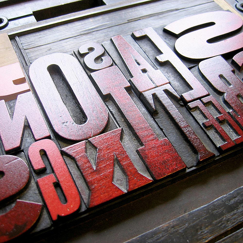
I’m addicted to paper that has been kissed by metal type. And, sometimes.. sometimes it doesn’t even need to be metal type—it can be photopolymer plates, which is sort of like metal type but… different… it’s a whole Pepsi vs Coke thing… Even wood type will flame my passions. Oh, blissful wood type. However it’s pressed, I love paper that’s been squashed; that’s been impressed upon by inked letters and… ohhh… but… yes, yes, even on the dark, quiet nights, when I just need my fix, I’ll even go as far as to enjoy the sweet, naked bliss of a blind emboss. That’s right! I’m a print designer who loves the look of paper that’s been printed without ink! It just feels so good and I am not afraid to admit it so.

I’m not even sure when my story of addiction began. I don’t remember my first taste. I must have been 16 years of age the first time I got a sniff of it. Just a whisper. It was all I needed.
I was starting to look at graphic art and design and get excited about this new world of beauty. DesignIsKinky served as my gateway—showing me things I’d never seen before—expanding my mind into the little hours of the morning. Once in a while I would hear the voices talking to me. I would shake my head and accept them as background noise – I wasn’t here to see them. Not yet, anyway.
But… but they grew louder. “Who… who are you?” I once said aloud, realising I was talking to a computer screen and feeling a little ashamed. Then… “We are the letterpressed, come play with us.” I awoke the next morning in a pool of cold sweat. I had seen something the night before. And it was special. Beautiful.

Time passed, my studies began and ended. I got married, started my life, every now and then smirking and smiling at pieces of letterpressed work—the look of which is often emulated to great effect in modern print and on the web. Yes, yes… emulated. But then it changed, the recreational enjoyment became a lot more. The voices were back.
Come late 2007, I began to become a lot more adventurous in my travels over the fields of the internet, subscribing to many an RSS feed. This is when I really started to enjoy this addiction. It’s when it all changed.
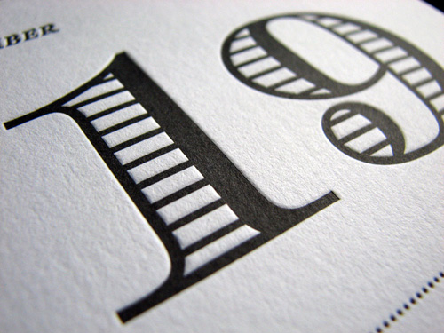
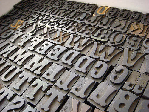
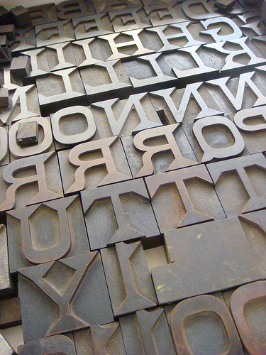
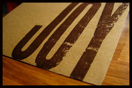
The traditional look, the style of the thick rules, double rules, dotted and dashed rules had lived on! People still used these machines! The capitlized letters in abundance, the loosely tracked headings and the one and two colour jobs! The crafters of this immense beauty were still to be found! Their works being printed, being crafted, each unique due to the physicality of the materials! Oh, the materials!! Typography with dimension dances with paper of sophistication to the tune of the machines while they chant their muse-songs; whoosh-clutch, whoosh-clutch, whoosh-clutch!
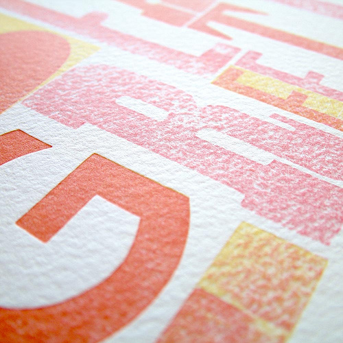
And the paper! Ohh, oh, oh the paper! It isn’t flat. It isn’t perfect—it has bumps, it is off white—you can see the grain, feel the fiber! And when it dances with the type, whether it be naked or dressed in the robes of Reflex Blue, Rubine Red, Orange 021 or whatever the heart of the job demands, something beautiful happens! Something glorious!
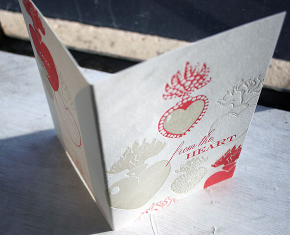
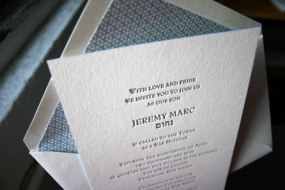
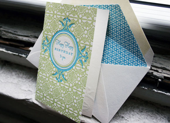
Something we, as creatives, want more than anything. These flocks of cards, gallops of bookmarks and packs of invites engage the audience. They bring in their attention, whispering to them the secrets of the letterpressed—“feel the impression”, they say, “tickle the stock”, they entice.
There are no runs of 5,000. No runs of 10,000 or a million! They are pressed in small groups. Giving the magicians of tangible type an opportunity to use stocks of a unique kind, a special kind. Hand made stock can be brought to the dance! Stock with fibers and hairs as long as the lashes on the lids of your eyes! Specks and spots! The stocks alone invite one to touch and caress. They give large, solid spaces of colour an opportunity to develop character when they print isn’t perfect and thank all that is beautiful that it never is! The imperfect paper gives the ink a stage on which to dance, rather than a cage in which to perform.


And it is in this that so much beauty can be found. Where the craft resides. The physical type, which succumbs to the scars of use, the paper which isn’t smooth but charactered, and the ink that doesn’t always cover—these three work together in a way that cannot be, and should not be, perfectly mastered, lest this craft be lost. For it is this result of craft that gives the character that I so love.
My name is Alex Charchar and I’m addicted to the craft and character of letterpress works.
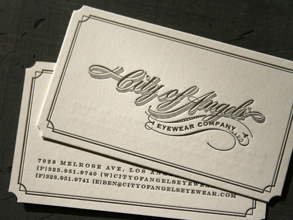
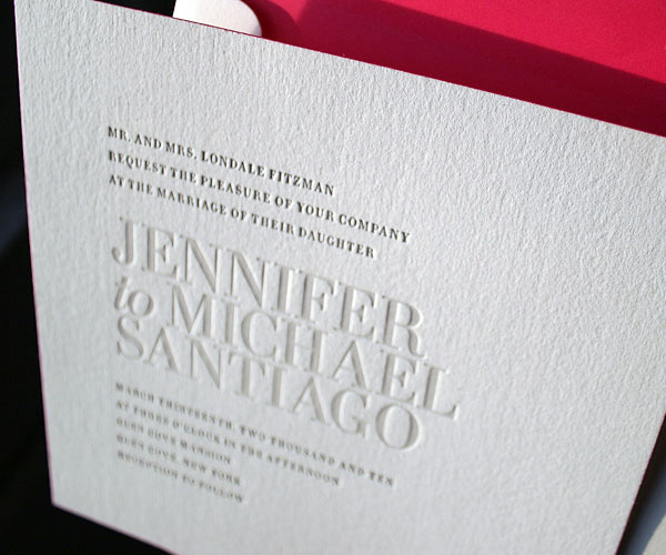
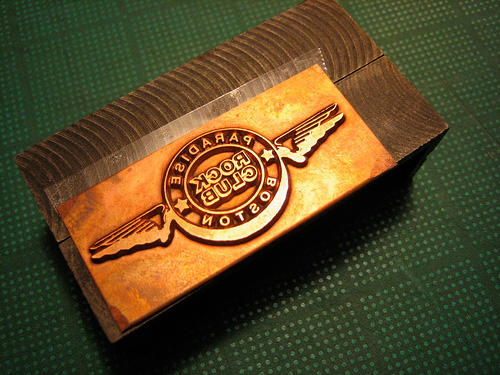
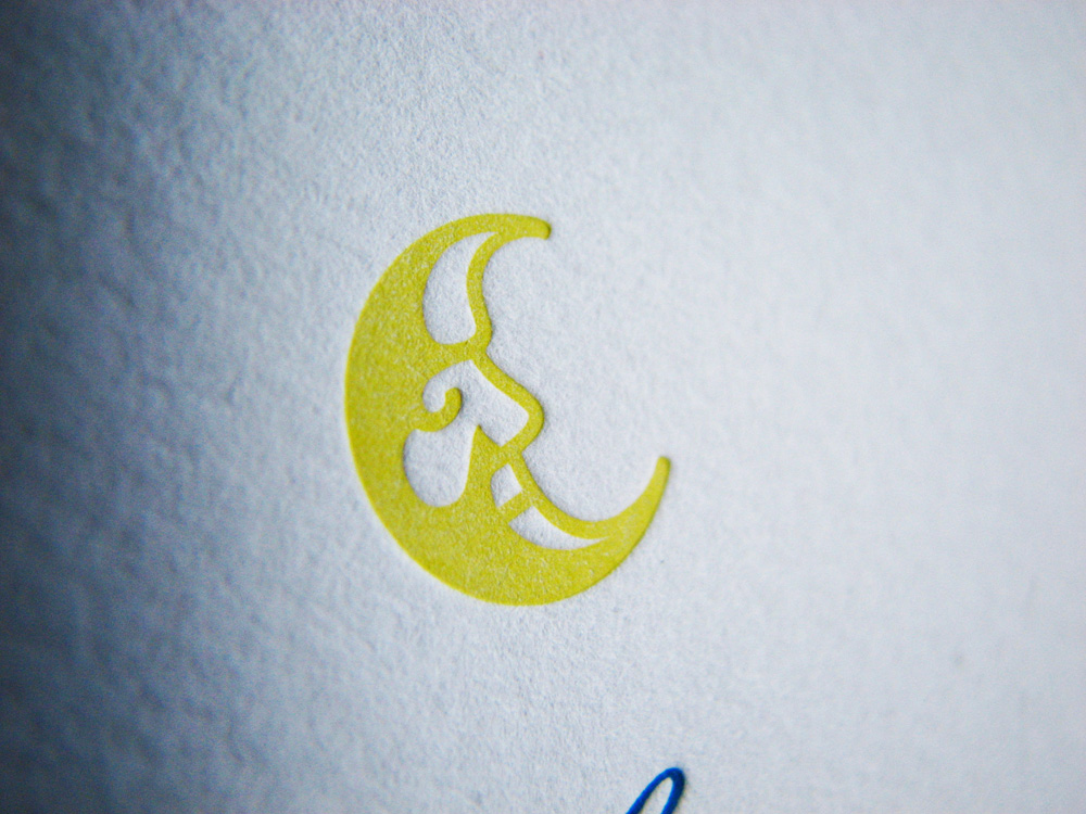
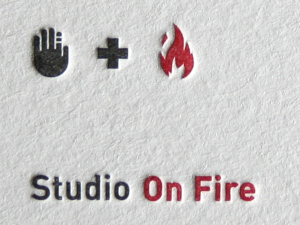
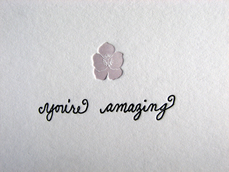
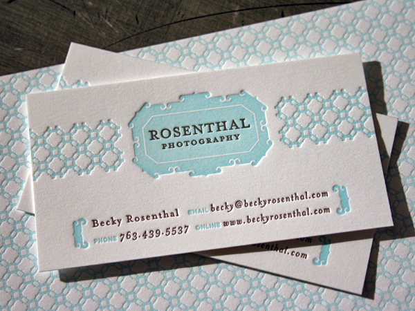
Gallery
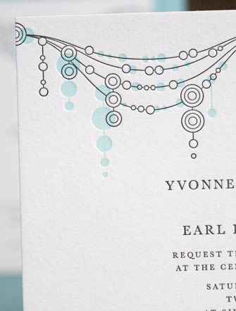

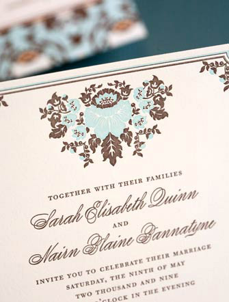


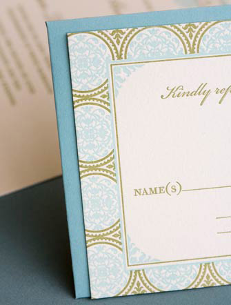

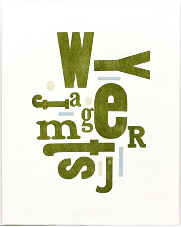


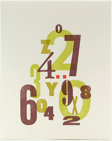

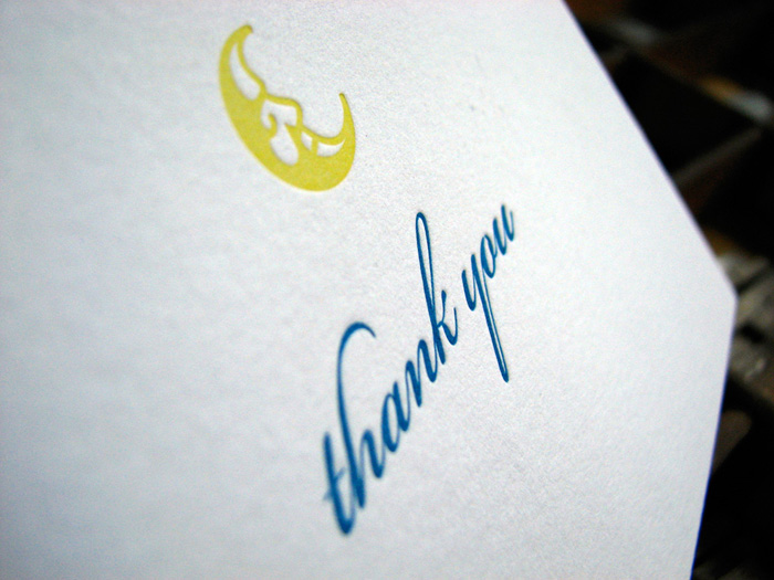
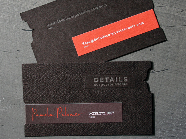


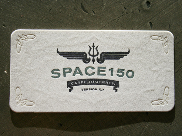

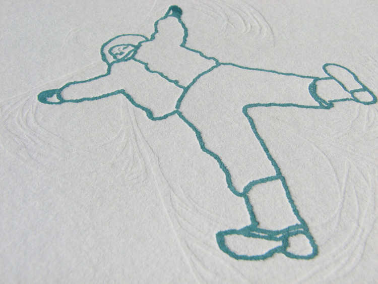


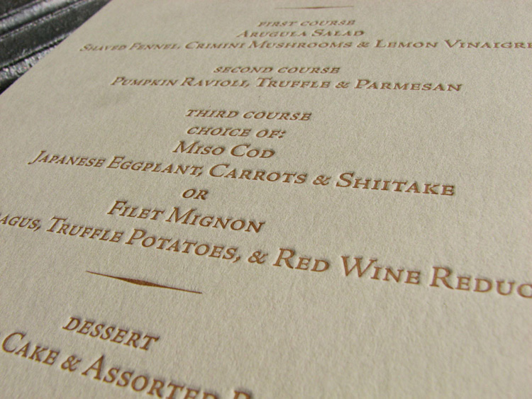
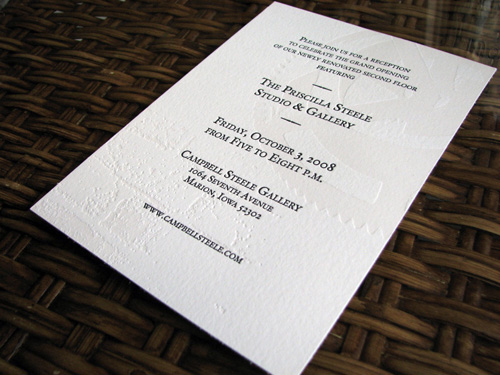
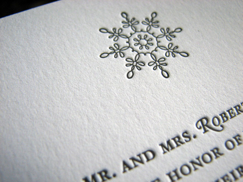

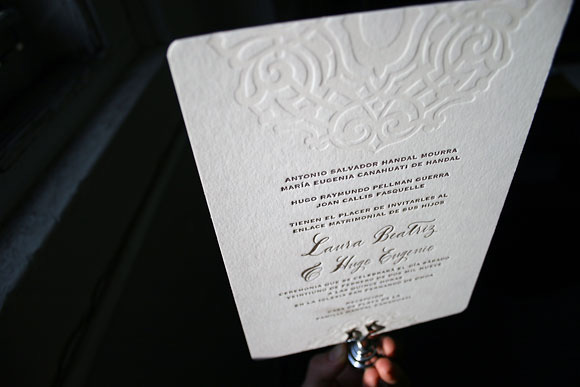
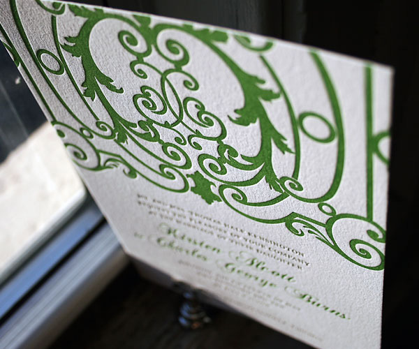
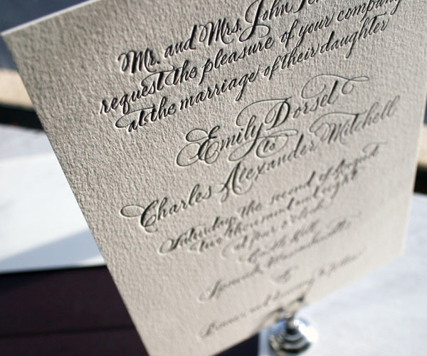


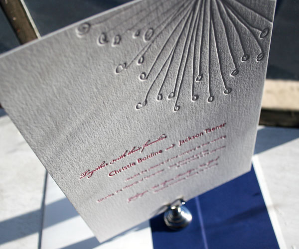
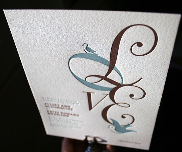

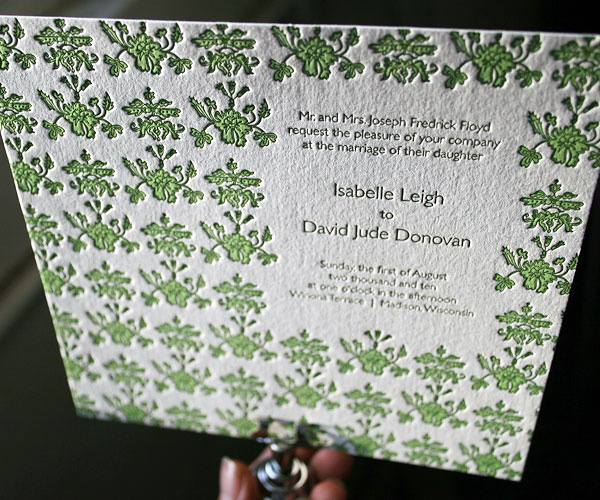


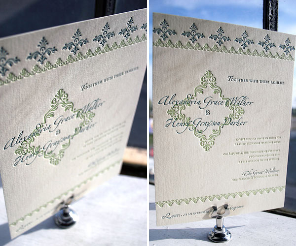
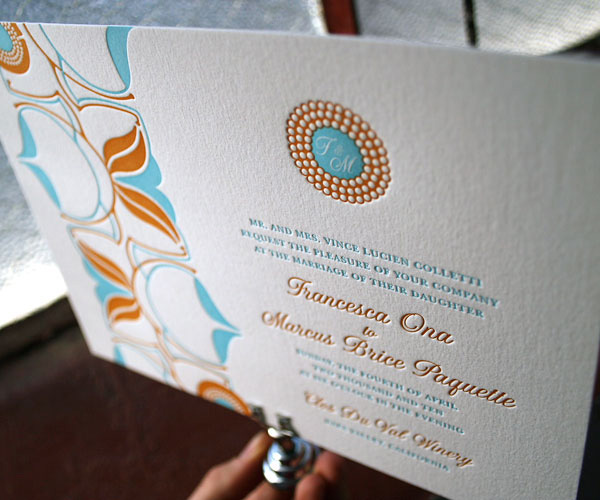

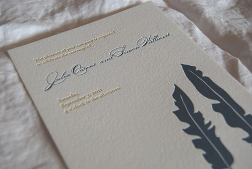
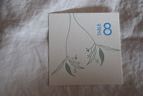


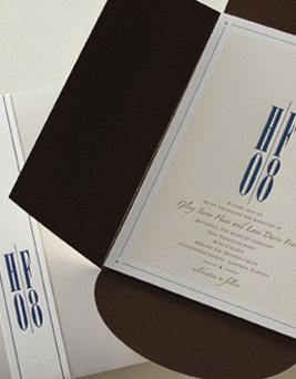

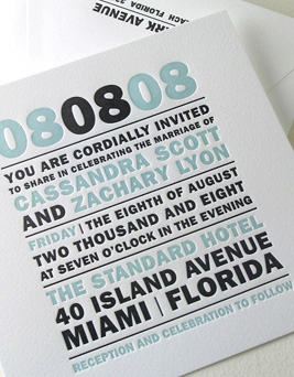

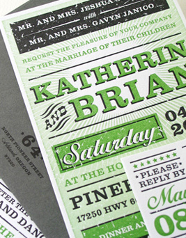
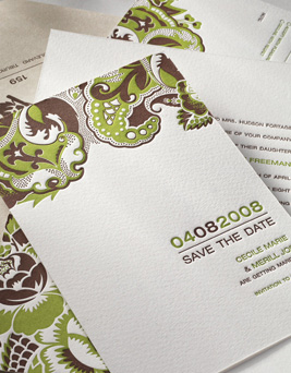
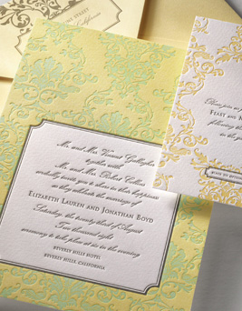
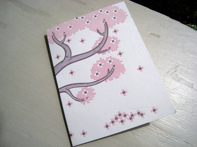


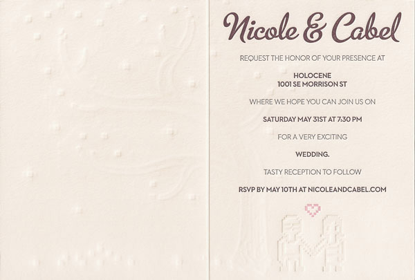
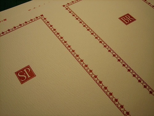
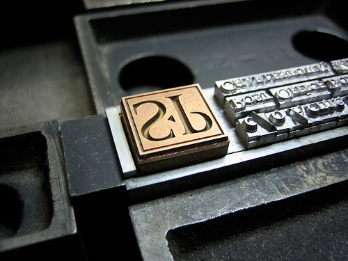


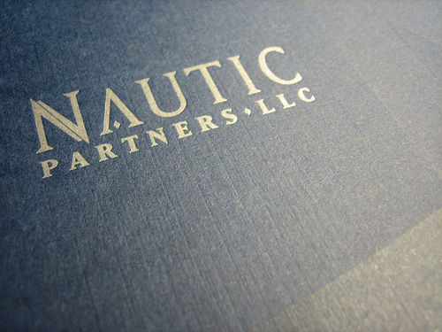


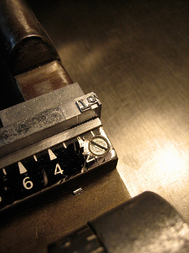


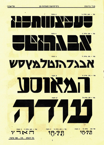

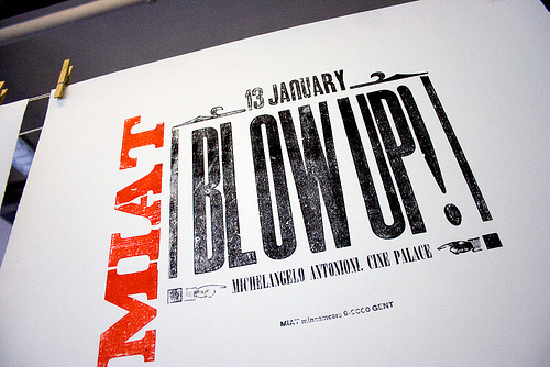


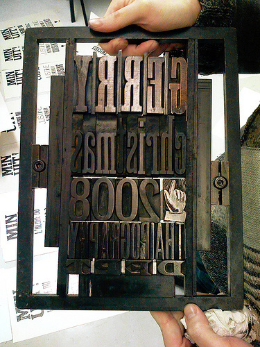


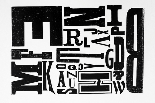
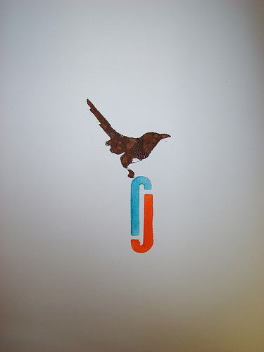
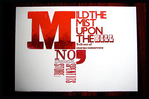
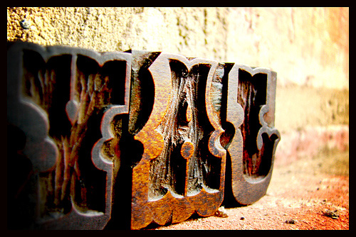
The above images came from a number of sites, including Hello Lucky, Greenchair Press, Brooklyn Bookbinder, Beast Pieces, Smock Paper, Bellafigura, Satsuma Press, Elum Designs, Cabel, the Letterpress Process Flickr collection, the Woodtype Flickr Pool, Jaypeg’s 30 Letterpress Flickr collection.
Also, if there are any images that catch your eye and you’d like to know who exactly produced it, just ask for it by referencing the image number or url – it’ll also help if you could give a super-quick (two or three word) description just to confirm and I’ll let you know where it came from (go on, try me!).
So, what’s your creative addiction?
Master Your Craft.
Weekly.
Become the designer you want to be.
Join a group of talented, creative, and hungry designers,
all gaining the insight that is helping them make
the best work of their lives.